
Jakob Nielsen of the Nielsen Norman group in his article about persuasive design, cites four ways to win a users trust. These four ways include design quality, upfront disclosure, comprehensive and current content, and connection to the rest of the web.
On April 2015 Google released an algorithm to make all websites mobile friendly. Mobile friendliness is paramount to a website’s ranking in SERPs. Thus, if your website layout is not altered to fit the facets of mobile phones, it will drop in ranking.
A website is deemed responsive when it:
1. Is independent of the software that is not supported on the mobile.
2. Has readable text which does not need to be sized up.
3. Is tailored to fit the dimensions of the mobile screen so that no horizontal scrolling is required.
4. Has appropriate distance between two links to avoid inconvenience while clicking.
Custom web development companies in India make sure to follow these four tips in order to develop a website that is not only responsive but also adhere to the Google algorithms.
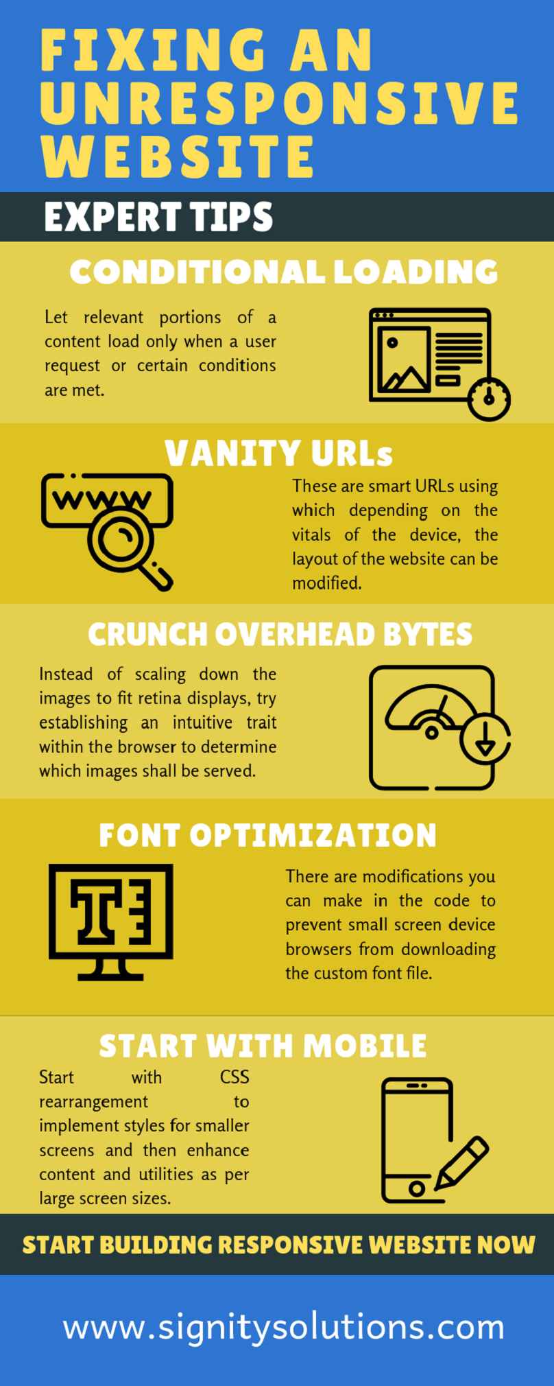
Expert tips to resolve the unresponsive issue of websites
1. Conditional Loading
Slow loading times are a big put off. It diminishes the user’s enthusiasm and interest in your website. Needless to say, the user leaves!
Conditional loading is basically, a process in which relevant portions of a content is broken down into HTML sections so that they will be loaded only when a user request or certain conditions are met.
How can you prevent this?
Use big data analytics solutions to recognize patterns of user interests and search behavior. The kind of content and information that appeals to the user forms the key ingredient of the speed-up soup.
Once you have an idea about the most desirable content, make the arrangements/changes in the website to load that content first. This method is termed conditional loading.
For example, say your viewers are more interested in reading the product information. Prioritize this content in the sequence of loading. The images, carousels, and other elements fall later in the order.
By following expert advice such as conditional loading, vanity URLs and identity and access management solutions, organisations can ensure that their websites are not only responsive, but also remain secure and efficient.
2. Vanity URLs
Vanity URLs are customized short links which features your brand name or a keyword pertaining to your business.
Now, how can vanity URLs support the implementation of a responsive website design?
These URLs can be used to create page aliases for mobile devices. These are smart URLs which determine the device’s user agent to understand the type of device requesting website access. Therefore, depending on the vitals of the device, the layout of the website can be modified.
3. Crunch Down Overhead Bytes
Designing usually starts with the desktop view as a yardstick for optimized design. However, mobile responsive designs come as alterations of coding for this very desktop view, by adding media queries to visually scale down images for small screens.
This does not help responsive design as it is served to all devices in the same size. In other words, an image designed for desktop is served to mobiles and tablet screens in the same size as it is served to retina displays. Retina displays are known to cram twice the number pixels in their screens, so the image looks brisk. But for the other half who does not use a retina display are unrightfully forced to download an extra set of overhead bytes.
Analyze the images on the website to create a device-specific retrieval.
How can you accomplish this?
RESS (Responsive web design with server-side components) is a highly understated remedy for creating optimized designs for different devices. Instead of scaling down the images to fit retina displays, custom web development company should try to establish an intuitive trait within the browser to determine which images shall be served.
Create a script for user agent to ascertain the screen size, touch capability, etc. of the device. Define breakpoints for creating, caching, and delivering the appropriate images.
4. Font Optimization
Font files call for additional requests as well as amplified page weights. There are modifications you can make in the code to prevent small screen device browsers from downloading the custom font file.However, all you need to do is set reserve fallback font for content and insert a media query to set web font rolling only at a larger threshold of screen resolution. Custom web font file will thus only be downloaded for a device that aligns with the media query:
@font-face {
font-family: 'FontName';
src: url('fontname.woff') format('woff');
}
body {
font-family: Helvetica, sans serif;
}
@media (min-width: 1200px) {
body {
font-family: 'FontName', Helvetica, sans serif;
}
}
5. Start with Mobile
This is a total shift from the routine development perspective. However, it only makes more sense with all these growing websites responsive issues. The major concern of providing a consistent experience across platforms is preventing mobile app developers from considering the most important aspect – user needs.
When you start with smaller screens, you are forced to look at the imperative elements and functionalities. Start with CSS rearrangement to implement styles for smaller screens and then enhance content and utilities as per large screen sizes. Once the core functionality is set, test for other conflicts like janky scrolling and appropriate dimensions of asset sizes. Deliberating performance with this approach will simplify decision making in terms of larger screen asset sizes and content hierarchy.
Once you realize the objective of the page, it will be easier to prioritize its contents. Accessibility to devices with slow connectivity and those with conventional functionalities is also an important dynamic to be considered. As a designer, you can avoid the perplexity of renovating the development environment from desktop to mobile. The other way round is definitely more efficient!
Here is the infographic:
Checkout the video to know the questions before building a responsive website:
Conclusion
User experience drives the idea of responsive web design. Use analytics to derive insights on user behavior as well as interests. Test every page of the website for lack of device-specific conflicts. Work on the highlighted predicaments that drain your website traffic owing to limited responsive value.
Statistics point to the fact that half of the visitors never visit a website with which they share a history of troubled viewing. Thus, in the quest of making websites responsive for devices, you might totally forget the user.
This causes you to focus more on the device optimization than user experience. How are these two things different, you ask? They are essentially the two sides of a biased coin. Yes! The latter carries more weight and mandates the former.
Looking to outsource your website development needs to India? Outsourcing to India can be a worthwhile option to make your website more responsive. Hire our team of expert web developers now. They will assist and consult you in making your website user and device friendly.