
.png?width=27&height=27&name=Group(1).png)
-1.svg)
-1.svg)
-2.svg)

.svg)
.png?width=344&height=101&name=Mask%20group%20(5).png)
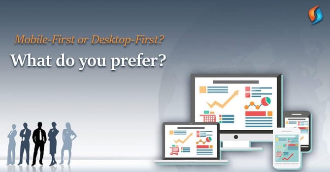
Have you recently started a new business and you want some significant online presence? Or do you want to expand your old traditional business’s reach by simply having a website? Or do you have an amazing new idea for a tech start-up that will create a revolution in the industry? It can even be neither of the two, as you just design customized websites for any of the above mentioned? There is one question which should come in your mind before you sit down and get your hands dirty with web designing i.e., what will be my responsive strategy? And fortunately or unfortunately, you have only two very popular choices for now: Mobile-first or Desktop-first
Although you may think that choice can be made easily by bench-marking the competition but it is actually easier said than done. However, you need not worry because an experienced custom web development company can assist you in deciding a responsive strategy. This is done by looking at numerous financial and technical aspects of your business.
Before getting into the details of these two strategies, let us first understand
What do you mean by responsive strategy?
In very simple terms, a responsive strategy can be defined as an overall approach towards the design of your website such that end user gets an excellent experience in terms of content, navigation, download speed, and screen resolution etc. in their devices.
With the increasing internet penetration, it has become very necessary for the businesses to be able to attract the maximum amount of traffic on their websites as well as engage them with fantastic user-experience. Therefore, it is very crucial to decide upon the responsive strategy, whether mobile-first or desktop-first, to lure the target audience.
Now let’s talk about the difference between two approaches:
Desktop-first Responsive Strategy
When most of your target audience uses big screens like that of laptops and desktops, you should design for a display with maximum information and specifications to communicate as much as you can. In this case, you mainly focus on smooth, detailed, engaging and dynamic user experience on the desktop instead of a mobile.
And when you go for the small screens, you wrap or hide some elements. This we do such that the original features remain active. In this case, you concentrate lesser on the user experience and more on the operational side of the website on mobile.
This approach is ideal when businesses have B2B transactional nature. It is because most of the work there is done through desktops and laptops. This kind of design is also used by mobile application development company when businesses choose to go for mobile apps to optimize the user experience on mobile phones.

(Image source: bluefountainmedia.com)
Mobile-first Responsive Strategy
With the increasing availability of affordable smartphones and cheaper data packs, it is becoming more than obvious that people will rely more on that friend which stays in their pocket for any online work. Corporates can also smell this and hence, every prominent mobile application development company in India is making a fortune out of this.
Although both Mobile-first responsive website and mobile app have the same purpose, that is, optimizing user experience on a mobile phone but they are completely different in origin. Mobile-first approach mainly focuses on the core functions of a website with layers added to it making it operational on larger resolutions whereas a mobile app serves altogether as a separate platform on a mobile phone.
The mobile-first strategy needs a lot of research so that we can organize the content accurately on the basis of importance.
Although many designers feel that it is easier to start with the most essential part by Mobile-first strategy, there are many who feel that it put restrictions and limitations on imagination because canvas given for the painting is too small.

(Image source: superfastbusiness.com)
Let’s look at some key differences between Desktop-first and Mobile-First approaches from a technical perspective:
Differences Mobile-first & Desktop-first
 (Image source: bradfrost.com)
Which strategy is better?
Life would have been very easy if there were no parameters to make a decision between two choices. But unfortunately, this decision is also not that simple. And the classic correct answer to this question is “it depends”.
“Depends on what?” you asked? Let’s see some of the factors which can help you in taking one side out of the two for your business.
Traffic:
Who are your customers? Who will come to your website? Will they use smaller screens more to come to your website? Once, you have answers to these questions through big data analytics solutions, life will get simpler. Generally, designers follow the rule of 80% traffic. That is, if 80% of your hits will come from desktops then you should opt for desktop-first strategy. Similar holds true for the mobile-first strategy.
User-interface:
If your website is going to be rich in options, features, and content, then you should go for a desktop-first approach. And you can go for the other one if UI is going to be simple with fewer features and options.
Product type:
If your product is something which is going to help other businesses in increasing their productivity like software tools and services, then you can prefer a desktop-first approach. And if your product is something which is related to entertainment, news, travel, networking etc. then you should go for the mobile-first approach.
Budget:
Last and definitely not the least, you must not burn your pockets for your website design. Outsourcing to India can offer you a wide spectrum of prices for the development of a custom website. This may range from very cheap to very expensive. Therefore, you have to make a clearly defined budget for your website. Generally, the mobile-first approach can cost you more. It is because the mobile-first approach requires a lot of research and structure. Whereas simple desktop websites will cost you lesser. But at the same time, the cost also depends on the complexity and features you incorporate in the website.
In the end, it is advised to you that you should do your own research and analysis and then take a decision. Sometimes, only we know what works best for us.
You may also like: "How-To" Guide to optimize landing page for higher conversions
